From the first time I met the guys from this brand, I knew that they had clear ideas, they wanted a modern and versatile image that could be sold in a neighborhood store or in a gourmet place. So all that was left was to start from scratch with the development of the brand image and visual identity. Because we were two young guys, we agreed that the identity would be similar to their youth, their strong conviction, and ambition. They needed a brand that could stand out, be easily distinguishable, and last over time.
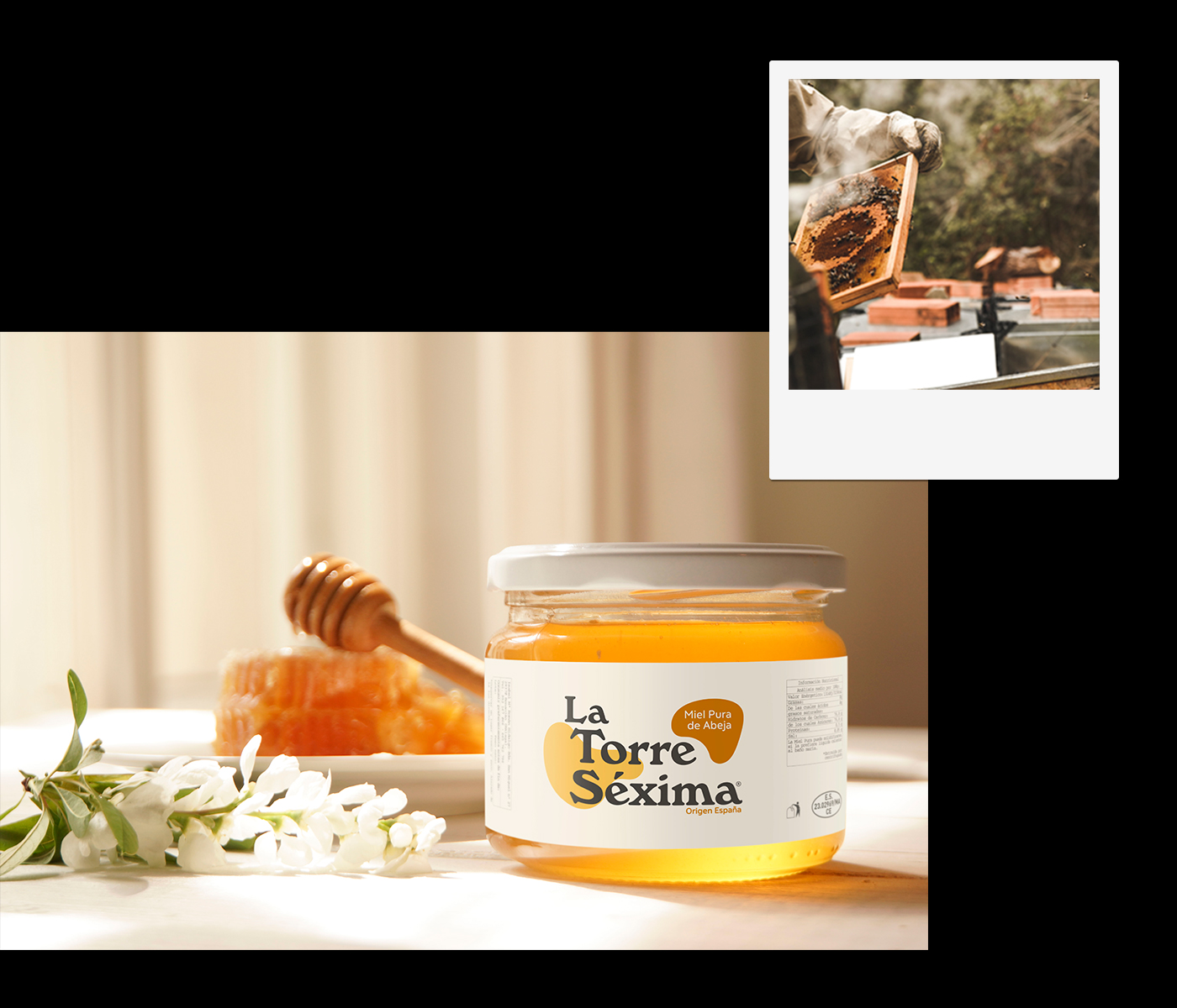
Since the beginning of the project, I decided to share with the kids the vision that the identity should be mainly typographic and from there add several graphic elements that will reflect the product for sale, which in this case was Pure Honey Bee.
Finally, I obtained the identity by starting to play with the forms that honey adopted when it was spread on a flat surface, adding details, color, making the forms similar to this liquid substance. The selected typography, combined with the curved shapes of the honey plus the selection of colors formed a very compact image.
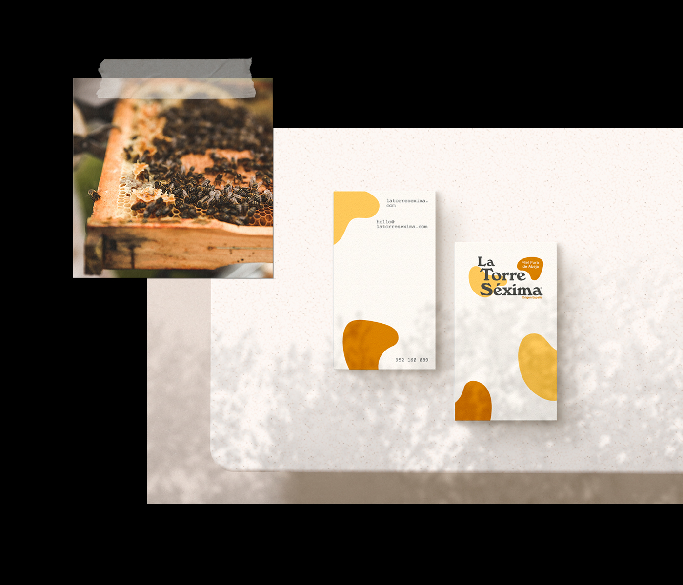
Once this was done I started with the graphic applications for the different needs, in this case, the label for the product, business card, and packaging, in these designs, and in order not to lose the brand’s thread I continued applying the curved shapes.